Turn on suggestions
Auto-suggest helps you quickly narrow down your search results by suggesting possible matches as you type.
Showing results for
Turn on suggestions
Auto-suggest helps you quickly narrow down your search results by suggesting possible matches as you type.
Showing results for
Community Tip - You can change your system assigned username to something more personal in your community settings. X
- Community
- Creo (Previous to May 2018)
- Creo Modeling Questions
- Re: Gtol sym size mismatch
Options
- Subscribe to RSS Feed
- Mark Topic as New
- Mark Topic as Read
- Float this Topic for Current User
- Bookmark
- Subscribe
- Mute
- Printer Friendly Page
Gtol sym size mismatch
Sep 25, 2015
02:29 AM
- Mark as New
- Bookmark
- Subscribe
- Mute
- Subscribe to RSS Feed
- Permalink
- Notify Moderator
Sep 25, 2015
02:29 AM
Gtol sym size mismatch
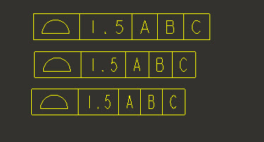
In this first line is created by using the Custom symbol method and second
one is as free note. in G-Tol I face the spacing problem (Refer the Pic)
If any one knows how to solve this issue, help me
Thanks
Mohan.
6 REPLIES 6
Sep 25, 2015
11:14 AM
- Mark as New
- Bookmark
- Subscribe
- Mute
- Subscribe to RSS Feed
- Permalink
- Notify Moderator
Sep 25, 2015
11:14 AM
Could you describe these two workflows? To me, it sounds like one is a custom symbol you defined by sketching the lines and putting notes in it, and the second is a note using boxed text to resemble a gtol, but that wouldn't make a lot of sense, so I imagine you mean something else.
Sep 25, 2015
12:37 PM
- Mark as New
- Bookmark
- Subscribe
- Mute
- Subscribe to RSS Feed
- Permalink
- Notify Moderator
Sep 25, 2015
12:37 PM
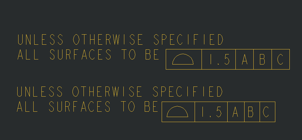
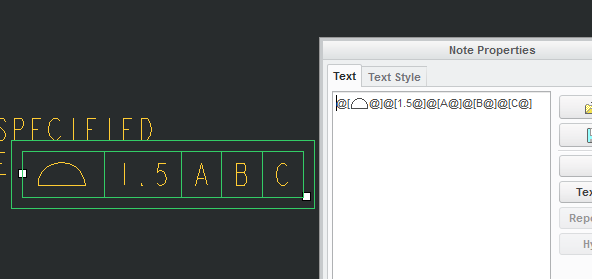
I was able to repeat what I think Mohan did and got the same results:
I the image, the top frame was created by using the @[ and @] in the note. The lower frame was built using the annotation Geometric Tolerance button.
The problem is that a frame created by using the @[ and @] in the note have a different spacing on the boxes than a frame created from the button on the toolbar and placed as a free note in the drawing. If you look at the image above, every block is just a little bit more narrow in the second (button generated) frame than the note built one.
The differences occur at various points:
1. In the symbol block, the extra width occurs after the symbol
2. in all other blocks, the extra width occurs prior to the text
@Mohan: I tried messing around with the fonts (changed font, size, text alignment) to see if it was an alignment issue, but I could not find anything that would change the spacing. It looks like Creo defaults all spacing in the custom note version to be centered with equal space before and after, while the guided button generated process left-aligns the symbol and right-aligns the text (if you look, you can see the spacing on the left and right of each box is different).
In short: I have no clue why it operates this way, nor do I know how to fix it.
Sep 25, 2015
02:18 PM
- Mark as New
- Bookmark
- Subscribe
- Mute
- Subscribe to RSS Feed
- Permalink
- Notify Moderator
Sep 25, 2015
02:18 PM
If these the workflows you're using as well (gtol vs. note with boxed text), then yes, I can confirm that a note with boxed text can look functionally like a feature control frame, but not identical. I'm not sure what the end goal is for you, but this may be helpful:
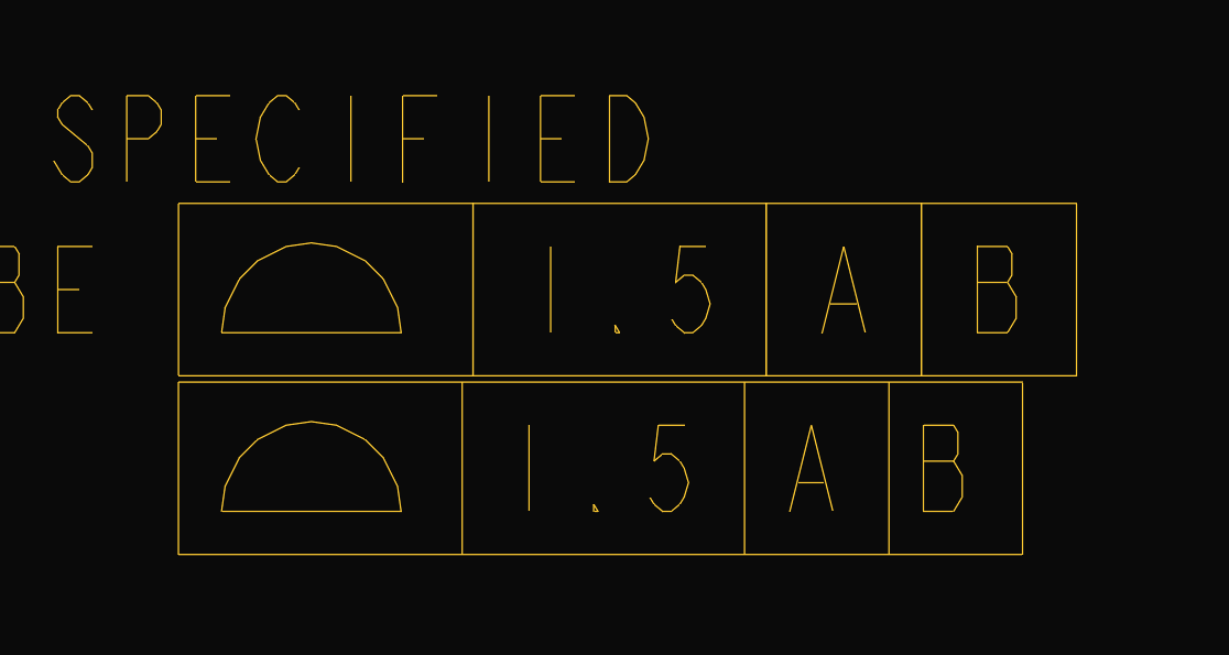
For the exact spacing between text as seen in the gtol, you can put the text together separated by the narrow space which is '|' in the special character set: (^A / ^B donate entering/exiting special character set)
^Aj|^B.001^A|^BA^A|^BB^A|^BC
This will not, however, include the box lines, which are calculated for gtol display by looking for the ^A|^B character in the final text. So if you were, say, making a custom symbol that was a fake gtol, you'd need to add the lines.
Sep 29, 2015
03:17 AM
- Mark as New
- Bookmark
- Subscribe
- Mute
- Subscribe to RSS Feed
- Permalink
- Notify Moderator
Sep 29, 2015
03:17 AM
The second one is made as usual GTol symbol method
The first symbol is made by Custom symbol
See the snapshots
Sep 25, 2015
12:42 PM
- Mark as New
- Bookmark
- Subscribe
- Mute
- Subscribe to RSS Feed
- Permalink
- Notify Moderator
Sep 25, 2015
12:42 PM
Mohan,
As Matt suggested describe the workflow/steps to check that in detail. If possible you, capture the steps in video and attach to post.
Sep 25, 2015
04:15 PM
- Mark as New
- Bookmark
- Subscribe
- Mute
- Subscribe to RSS Feed
- Permalink
- Notify Moderator
Sep 25, 2015
04:15 PM
Possibly look at the width factor on the text style. I was able to vary the free note by varying the text width factor.