
Turn on suggestions
Auto-suggest helps you quickly narrow down your search results by suggesting possible matches as you type.
Showing results for
Turn on suggestions
Auto-suggest helps you quickly narrow down your search results by suggesting possible matches as you type.
Showing results for
Community Tip - When posting, your subject should be specific and summarize your question. Here are some additional tips on asking a great question. X
Options
- Subscribe to RSS Feed
- Mark Topic as New
- Mark Topic as Read
- Float this Topic for Current User
- Bookmark
- Subscribe
- Mute
- Printer Friendly Page
Combining/Interpolating Mismatched Data
Jan 25, 2012
07:45 PM
- Mark as New
- Bookmark
- Subscribe
- Mute
- Subscribe to RSS Feed
- Permalink
- Notify Moderator
Jan 25, 2012
07:45 PM
Combining/Interpolating Mismatched Data
Hi, All --
I have some data that I digitized from another source. Essentially, I digitized a plot of p vs. q and another of p vs. e. However, what I really need is a plot of q vs. e. The problem, of course, is that since the data are digitized, the two data sets have a different number of rows and also different values for p. To make matters worse, the p-q data increase and decrease in both variables, so they can't be splined. I guess I can think of a couple of brute force ways to attack this, but does anyone have a slick solution?
Thanks in advance.
Matt
Labels:
- Labels:
-
Statistics_Analysis
20 REPLIES 20
Jan 26, 2012
08:05 AM
- Mark as New
- Bookmark
- Subscribe
- Mute
- Subscribe to RSS Feed
- Permalink
- Notify Moderator

Jan 26, 2012
08:08 AM
- Mark as New
- Bookmark
- Subscribe
- Mute
- Subscribe to RSS Feed
- Permalink
- Notify Moderator
Jan 26, 2012
08:08 AM
Hi, Mike --
Thanks for looking at my problem. However, I'm still not exactly sure what the second axis gets me -- I understand your point, but I still don't have a plot of q vs. e that is easy to understand. Am I missing something?
Matt
Jan 26, 2012
08:11 AM
- Mark as New
- Bookmark
- Subscribe
- Mute
- Subscribe to RSS Feed
- Permalink
- Notify Moderator
Jan 26, 2012
08:11 AM
Maybe I missed something. You have called your variables p_e and p_q, I take it these are actually four seperate variables?
Mike
Jan 26, 2012
08:17 AM
- Mark as New
- Bookmark
- Subscribe
- Mute
- Subscribe to RSS Feed
- Permalink
- Notify Moderator
Jan 26, 2012
08:17 AM
No, you got it right -- p_q has p in the first column and q in the second -- p_e is the same. The two data sets are (theoretically, but I cannot confirm) from the same test, but digitized from two different plots.
Matt
Jan 26, 2012
08:27 AM
- Mark as New
- Bookmark
- Subscribe
- Mute
- Subscribe to RSS Feed
- Permalink
- Notify Moderator
Jan 26, 2012
08:27 AM
Sorry my mistake. Can you not change the range on the digitize to modify the number of rows?
Are you performing the digitize through Mathcad?
Mike
Jan 26, 2012
08:44 AM
- Mark as New
- Bookmark
- Subscribe
- Mute
- Subscribe to RSS Feed
- Permalink
- Notify Moderator
Jan 26, 2012
08:44 AM
Actually, someone else digitized the data. I don't know how they did it. That said, I typically use DataThief for digitization. It can follow a trace of a given color and provide as many data points as are necessary to define the curve (for the original p_e curve above, it was about 950 points). Thus, it is not trivial to get the exact same number of points on each curve.
Matt
Jan 26, 2012
08:47 AM
- Mark as New
- Bookmark
- Subscribe
- Mute
- Subscribe to RSS Feed
- Permalink
- Notify Moderator
Jan 26, 2012
08:47 AM
Thus, it is not trivial to get the exact same number of points on each curve.
Yes it it trivial. If you can obtain a copy of the graphs, there is a digitize which Valery has passed within this forum which might help.
Mike
Jan 26, 2012
08:49 AM
- Mark as New
- Bookmark
- Subscribe
- Mute
- Subscribe to RSS Feed
- Permalink
- Notify Moderator
Jan 26, 2012
08:49 AM
Ahhh...that's news to me. Do you happen to have a link? Or, do you know the topic of the original thread?
Jan 26, 2012
09:11 AM
- Mark as New
- Bookmark
- Subscribe
- Mute
- Subscribe to RSS Feed
- Permalink
- Notify Moderator
Jan 26, 2012
09:11 AM
Have a look at the attached.
Sorry I couldn't look into your problem in more depth, mad busy at the moment.
Mike
Jan 26, 2012
09:14 AM
- Mark as New
- Bookmark
- Subscribe
- Mute
- Subscribe to RSS Feed
- Permalink
- Notify Moderator
Jan 26, 2012
09:14 AM
Mike --
That looks great. How do you assign the picture to a variable? I've been playing with the matrix toolbar, but can't get it to work. Do I need to copy the image from another application and paste it?
Also, looking at the function, I still don't see how I can guarantee the same number of points in the traces, even if the images are the same size (i.e., the lengths of the lines could be different).
Thanks again.
Matt
EDIT: I figured out how to insert the image.
Jan 27, 2012
06:23 AM
- Mark as New
- Bookmark
- Subscribe
- Mute
- Subscribe to RSS Feed
- Permalink
- Notify Moderator
Jan 27, 2012
06:23 AM
Thanks for that worksheet.
Jan 26, 2012
08:44 AM
- Mark as New
- Bookmark
- Subscribe
- Mute
- Subscribe to RSS Feed
- Permalink
- Notify Moderator
Jan 26, 2012
08:44 AM
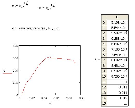
Have a look at the attached, I have used a brutal method, using predict function to get a result.
Mike
Jan 26, 2012
08:54 AM
- Mark as New
- Bookmark
- Subscribe
- Mute
- Subscribe to RSS Feed
- Permalink
- Notify Moderator
Jan 26, 2012
08:54 AM
Mike --
I don't think this works, exactly, although I am not familiar with the 'predict' function. It looks to me that you need to apply 'predict' to q rather than e since rows(q) < rows(e). When I try this, I get poor (i.e., negative, which is physically impossible) values for q. I'm not exactly sure what 'predict' is doing to e, because it appears to be trimming much of the original data from the top of the vector -- i.e., min(e_orig) = 0, min(e_modified) = 5e-3.
Thanks again.
Matt
Jan 26, 2012
09:06 AM
- Mark as New
- Bookmark
- Subscribe
- Mute
- Subscribe to RSS Feed
- Permalink
- Notify Moderator
Jan 26, 2012
09:06 AM
Yes I agree. I'm sure Richard might have an idea how to solve this issue.
Mike
Jan 26, 2012
09:43 AM
- Mark as New
- Bookmark
- Subscribe
- Mute
- Subscribe to RSS Feed
- Permalink
- Notify Moderator
Jan 26, 2012
09:43 AM
Can you say whaat this is data of? Looks like (maybe) a test of something to failure; both e and q have two different values for the same value of p. This suggests that something changed as the data was acquired. Is the data sequential in time order? (If we plotted the data in the order it's listed are the values in the order acquired?
Jan 26, 2012
09:48 AM
- Mark as New
- Bookmark
- Subscribe
- Mute
- Subscribe to RSS Feed
- Permalink
- Notify Moderator
Jan 26, 2012
09:48 AM
Fred -- yes, the data are sequential in time. The variables p, q, and e are mean stress, deviatoric stress, and axial strain, respectively. Thus, mean and deviatoric stress were increased at some constant rate and then mean stress was decreased while deviatoric stress was held constant.
Note that even though both data sets are sequential in time, I have no reason to believe that delta-t is the same for both because we aren't plotting the actual measured data. Does this make sense?
Thanks for looking at this.
Matt
Jan 26, 2012
03:20 PM
- Mark as New
- Bookmark
- Subscribe
- Mute
- Subscribe to RSS Feed
- Permalink
- Notify Moderator
Jan 26, 2012
03:20 PM
It's not pretty!
Fixed one stupid mistake.
Message was edited by: Fred Kohlhepp
Jan 27, 2012
07:49 AM
- Mark as New
- Bookmark
- Subscribe
- Mute
- Subscribe to RSS Feed
- Permalink
- Notify Moderator
Jan 27, 2012
07:49 AM
Added a comparison to the original data at the bottom.
The comparison shows indications thatthe original digitization may be suspect. Any chance of getting images of the originals?
Jan 27, 2012
09:28 AM
- Mark as New
- Bookmark
- Subscribe
- Mute
- Subscribe to RSS Feed
- Permalink
- Notify Moderator
Jan 27, 2012
09:28 AM
Hi, Fred --
Thanks for all of your work on this -- it is extremely helpful. I was hoping that there might be an approach that required little or no human interaction, but I am beginning to suspect that isn't the case. I have attached the original images below. I confirmed the p-e data (Fig2) using DataThief and got essentially the same values as those that were given to me (and that I provided on the original worksheet). I hae not independently confirmed the p-q data.
Matt
Jan 27, 2012
11:06 AM
- Mark as New
- Bookmark
- Subscribe
- Mute
- Subscribe to RSS Feed
- Permalink
- Notify Moderator
Jan 27, 2012
11:06 AM
I digitized (very coarsely) your images to even out the distributions. Things didn't change much.
Then I figured out how to simplify this.

