Turn on suggestions
Auto-suggest helps you quickly narrow down your search results by suggesting possible matches as you type.
Showing results for
Turn on suggestions
Auto-suggest helps you quickly narrow down your search results by suggesting possible matches as you type.
Showing results for
Community Tip - If community subscription notifications are filling up your inbox you can set up a daily digest and get all your notifications in a single email. X
Options
- Subscribe to RSS Feed
- Mark Topic as New
- Mark Topic as Read
- Float this Topic for Current User
- Bookmark
- Subscribe
- Mute
- Printer Friendly Page
help!.. how can i plot a 3d surface graph from 3 columns of data i've got in excel?
Mar 08, 2016
12:01 PM
- Mark as New
- Bookmark
- Subscribe
- Mute
- Subscribe to RSS Feed
- Permalink
- Notify Moderator
Mar 08, 2016
12:01 PM
help!.. how can i plot a 3d surface graph from 3 columns of data i've got in excel?
hi, this can't be hard can it?.. am new to mathcad and am trying to import 3 columns x12 rows of excel data by copy/paste into a table and/or a matrix etc with the intention of plotting on a 3d surface graph
...I can paste the values into the mathcad matrix ok but can't seem to assign a variable name to the matrix... so graph can't load it (nor can anything else refer to it I suppose)
...the table rows/columns aren't read in from the excel data - they are presumed 0, 1, 2 etc - so axes are preset to 0, 1, 2... rather than 1st 2 columns of data in excel file - graph just plots 3 columns of data imported as if they were functions f({0, 1, 2}, {0, 1, 2})... which seems a bit dim ...(my 3 columns in excel are the x, y, z) function should be {excel col3} = f({excel col1}, {excel col2})
I must be missing something obvious - can anyone help?
lots of thanks
Labels:
- Labels:
-
Statistics_Analysis
10 REPLIES 10
Mar 08, 2016
03:20 PM
- Mark as New
- Bookmark
- Subscribe
- Mute
- Subscribe to RSS Feed
- Permalink
- Notify Moderator
Mar 08, 2016
03:20 PM
In version 15, it's not hard:
- select the data in EXCEL and copy
- In version 15, type your matrix name and :=, then paste. And you have your matrix.
In Prime, I believe it's a bit more complicated. Insert an EXCEL component, paste the data into the component, and define your matrix from the component.
Mar 09, 2016
05:39 AM
- Mark as New
- Bookmark
- Subscribe
- Mute
- Subscribe to RSS Feed
- Permalink
- Notify Moderator
Mar 09, 2016
05:39 AM
dave norman wrote:
hi, this can't be hard can it?.. am new to mathcad and am trying to import 3 columns x12 rows of excel data by copy/paste into a table and/or a matrix etc with the intention of plotting on a 3d surface graph
...I can paste the values into the mathcad matrix ok but can't seem to assign a variable name to the matrix... so graph can't load it (nor can anything else refer to it I suppose)
...the table rows/columns aren't read in from the excel data - they are presumed 0, 1, 2 etc - so axes are preset to 0, 1, 2... rather than 1st 2 columns of data in excel file - graph just plots 3 columns of data imported as if they were functions f({0, 1, 2}, {0, 1, 2})... which seems a bit dim ...(my 3 columns in excel are the x, y, z) function should be {excel col3} = f({excel col1}, {excel col2})
I must be missing something obvious - can anyone help?
lots of thanks
Mar 09, 2016
06:34 AM
- Mark as New
- Bookmark
- Subscribe
- Mute
- Subscribe to RSS Feed
- Permalink
- Notify Moderator
Mar 09, 2016
06:34 AM
thanks for this - it's a brilliant reply!..
it's almost exactly what I wanted to do... but just one last thing... the x, y axes are labelled according to the row/column number of the data - can the x/y axes range be labelled from the min/max x, y values in the matrix array instead? (i.e. if the x value was say temperature, it would make sense to have the x-axis showing the temperature range, not just which row/column the data came from...)
ok.. hope clear to understand
Mar 09, 2016
06:54 AM
- Mark as New
- Bookmark
- Subscribe
- Mute
- Subscribe to RSS Feed
- Permalink
- Notify Moderator
Mar 09, 2016
06:54 AM
dave norman wrote:
thanks for this - it's a brilliant reply!..
it's almost exactly what I wanted to do... but just one last thing... the x, y axes are labelled according to the row/column number of the data - can the x/y axes range be labelled from the min/max x, y values in the matrix array instead? (i.e. if the x value was say temperature, it would make sense to have the x-axis showing the temperature range, not just which row/column the data came from...)
ok.. hope clear to understand
seperate each column with a column and wrap parentheses around the 3 columns.
Stuart
Mar 10, 2016
11:17 AM
- Mark as New
- Bookmark
- Subscribe
- Mute
- Subscribe to RSS Feed
- Permalink
- Notify Moderator
Mar 10, 2016
11:17 AM
ughhh... how do I separate each column with a column and wrap parentheses around them?.. (btw here is my x,y,z dataset)

I don't know what key strokes needed to do this... sorry
Mar 11, 2016
03:51 AM
- Mark as New
- Bookmark
- Subscribe
- Mute
- Subscribe to RSS Feed
- Permalink
- Notify Moderator
Mar 11, 2016
03:51 AM
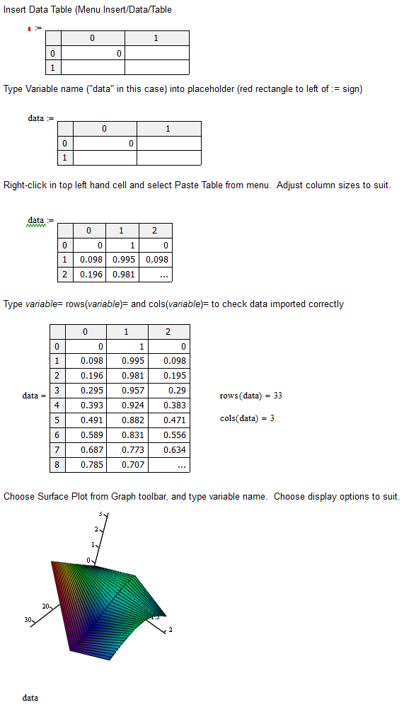
ok... have found out how this works now...
1) insert table -
2) type the name "data" in the square before the ":=" sign
2) click on the table and stretch object with mouse to give 3 columns and lots of rows
3) in EXCEL copy the data into the clipboard using CTRL-C
4) in the MATHCAD table, select all the cells with the mouse (click on top LH cell, hold down SHIFT and then click on bottom RH cell)
5) paste the EXCEL data using CTRL-V
6) insert a graph - select a 3d surface... you will see this...

in the red square, type this...
then click in the space between the 1st data and the comma, and type CTRL-6... you get this funny <> appearing, which I understand represents a column of data in a multi-dimensional table or matrix... (think of it as an EXCEL column)...
..so do this with all of the data entries...

then type in 0, 1, 2 as shown...

and the 3d surface appears like magic - it's a surface which covers the data like a table cloth - it passes exactly through all the points in the table - but also covers the space in between - I'm not sure but it's probably based on a spline surface)
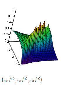
...only complaints with it are:
1) axes automatically start from zero rather than from the min data in each column- this seems illogical to me (after all, if you wanted the axes to start from zero, wouldn't a zero point already be inside the data?)
2) if you switch to another 3d data graph type, i.e. bar graph - the bars are drawn over the entire surface rather than just the at data points you had - this means your original data is obscured in the fitted surface - I can understand showing the entire surface data is reasonable for a surface plot, but think it doesn't make sense for a bar graph - why not plot the bars only on the original data and enable the 3d surface to be drawn over the top?
3) which brings me to my 3rd question... would be nice if 3d graph types could be superimposed on each other (i.e. a bar graph and a surface plot)
4) the 3d scatter plot is the only method of plotting the original dataset - but this is the least clear way to do it - you just end up with a load of coloured spots in 3d space and when you look at a single point, that you can't tell if it's towards the edges of the cloud of points or in the middle without rotating the cloud of points several times to see how the cloud of points moves relative the point you're looking at (see point 2 - a bar graph of the original data would look better)
in the end I've decided to go back to excel - which is really difficult to arrange the data in such a way that it can be plotted... but at least I can get a plot like this:

which is much better for what I need
...but I'm left feeling disappointed..
ok, I'm very new to Mathcad, and realise I may not know many tricks/clever things Mathcad can do.... so here's a challenge - can anyone do better than my excel plot using Mathcad?
Mar 11, 2016
04:04 AM
- Mark as New
- Bookmark
- Subscribe
- Mute
- Subscribe to RSS Feed
- Permalink
- Notify Moderator
Mar 11, 2016
04:04 AM
oh..sorry,
to help with this... here'e the original data set you can copy directly into a Mathcad data object
| 130 | 763 | 129 |
| 130 | 720 | 28 |
| 150 | 770 | 137 |
| 155 | 745 | 142 |
| 180 | 774 | 172 |
| 180 | 728 | 24 |
| 185 | 770 | 26 |
| 185 | 722 | 18 |
| 210 | 774 | 17 |
| 210 | 715 | 21 |
| 230 | 773 | 161 |
| 260 | 765 | 10 |
Mar 11, 2016
08:09 AM
- Mark as New
- Bookmark
- Subscribe
- Mute
- Subscribe to RSS Feed
- Permalink
- Notify Moderator
Mar 11, 2016
08:09 AM
..too late - have now written a macro in excel vba that does the donkey work to prepare the data to plot - so am sticking with excel
Mar 11, 2016
12:55 PM
- Mark as New
- Bookmark
- Subscribe
- Mute
- Subscribe to RSS Feed
- Permalink
- Notify Moderator
Mar 11, 2016
12:55 PM
> can anyone do better than my excel plot using Mathcad?
You would have to define "better".
So far you had not mentioned what you expected to see exactly. You just asked for "plotting a 3d surface graph" and the Excel plot you just showed and seem to be happy with sure is not what I would call a surface plot.
You must keep in mind, that Mathcad is a math program for engineers and while it provides a bunch of functions for data analysis its main goal is not statistics. So the possibilities for pie charts, bar charts etc. are rather limited.
Mar 14, 2016
04:22 AM
- Mark as New
- Bookmark
- Subscribe
- Mute
- Subscribe to RSS Feed
- Permalink
- Notify Moderator
Mar 14, 2016
04:22 AM
thanks werner,
Mathcad is quite new to me, and partly, what I'm trying to do is understand it better. Your reply has helped me a geat deal in this respect, thanks again, Dave