Turn on suggestions
Auto-suggest helps you quickly narrow down your search results by suggesting possible matches as you type.
Showing results for
Turn on suggestions
Auto-suggest helps you quickly narrow down your search results by suggesting possible matches as you type.
Showing results for
Options
- Subscribe to RSS Feed
- Mark Topic as New
- Mark Topic as Read
- Float this Topic for Current User
- Bookmark
- Subscribe
- Mute
- Printer Friendly Page
why cannot this simple graph be plotted correctly?
Aug 10, 2011
09:33 PM
- Mark as New
- Bookmark
- Subscribe
- Mute
- Subscribe to RSS Feed
- Permalink
- Notify Moderator
Aug 10, 2011
09:33 PM
why cannot this simple graph be plotted correctly?
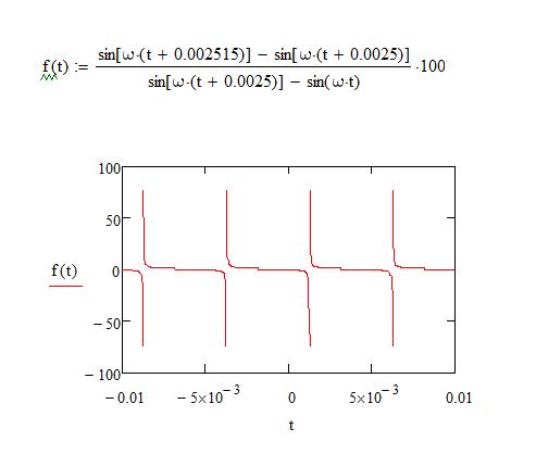
Please find why I cannot graph this correctly in period
In the graph, why is the period T not equat 2 pi / 6283.2 = 0.001second ?
How to make this graph correctly?
Thanks
Solved! Go to Solution.
Labels:
- Labels:
-
Other
1 ACCEPTED SOLUTION
Accepted Solutions
Aug 10, 2011
09:58 PM
- Mark as New
- Bookmark
- Subscribe
- Mute
- Subscribe to RSS Feed
- Permalink
- Notify Moderator
24 REPLIES 24
Aug 10, 2011
09:58 PM
- Mark as New
- Bookmark
- Subscribe
- Mute
- Subscribe to RSS Feed
- Permalink
- Notify Moderator
Aug 11, 2011
06:06 PM
- Mark as New
- Bookmark
- Subscribe
- Mute
- Subscribe to RSS Feed
- Permalink
- Notify Moderator
Aug 11, 2011
06:06 PM
Thank you very much.
I am beginer. I got another plot, I do not know why I cannot plot all red line ?
There suppose to be a continuous red line. Please give me advice.
Thank you
Aug 11, 2011
10:36 PM
- Mark as New
- Bookmark
- Subscribe
- Mute
- Subscribe to RSS Feed
- Permalink
- Notify Moderator
Aug 11, 2011
10:36 PM
Attach please the file!
Aug 12, 2011
01:39 AM
- Mark as New
- Bookmark
- Subscribe
- Mute
- Subscribe to RSS Feed
- Permalink
- Notify Moderator
Aug 12, 2011
02:16 AM
- Mark as New
- Bookmark
- Subscribe
- Mute
- Subscribe to RSS Feed
- Permalink
- Notify Moderator
Aug 12, 2011
02:16 AM
It's because you have only defined t up to 0.01.
Have a look at the attached.
Mike
Aug 12, 2011
02:33 AM
- Mark as New
- Bookmark
- Subscribe
- Mute
- Subscribe to RSS Feed
- Permalink
- Notify Moderator
Aug 12, 2011
02:33 AM
I think, it is better to use such record for function:
Aug 12, 2011
03:33 PM
- Mark as New
- Bookmark
- Subscribe
- Mute
- Subscribe to RSS Feed
- Permalink
- Notify Moderator
Aug 12, 2011
03:33 PM
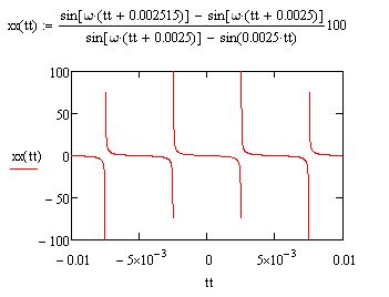
Please look, why my graph is different from yours. Which one is correct?
Aug 12, 2011
03:42 PM
- Mark as New
- Bookmark
- Subscribe
- Mute
- Subscribe to RSS Feed
- Permalink
- Notify Moderator
Aug 12, 2011
03:42 PM
Ruilin Yang wrote:
Please look, why my graph is different from yours. Which one is correct?
Have a look at my example.
Mike
Aug 12, 2011
03:45 PM
- Mark as New
- Bookmark
- Subscribe
- Mute
- Subscribe to RSS Feed
- Permalink
- Notify Moderator
Aug 12, 2011
03:45 PM
Where is your example? Please showm me why different.
Aug 12, 2011
03:48 PM
- Mark as New
- Bookmark
- Subscribe
- Mute
- Subscribe to RSS Feed
- Permalink
- Notify Moderator
Aug 12, 2011
03:48 PM
Below.
Mike
Aug 12, 2011
03:49 PM
- Mark as New
- Bookmark
- Subscribe
- Mute
- Subscribe to RSS Feed
- Permalink
- Notify Moderator
Aug 12, 2011
03:58 PM
- Mark as New
- Bookmark
- Subscribe
- Mute
- Subscribe to RSS Feed
- Permalink
- Notify Moderator
Aug 12, 2011
03:58 PM
My question is why we got different results ? Why?
Aug 12, 2011
04:08 PM
- Mark as New
- Bookmark
- Subscribe
- Mute
- Subscribe to RSS Feed
- Permalink
- Notify Moderator
Aug 12, 2011
04:08 PM
Your scale on the graph. Have a look at the attached.
Mike
Message was edited by: Mike Armstrong - Oh, I also removed the definition of t.
Aug 12, 2011
04:15 PM
- Mark as New
- Bookmark
- Subscribe
- Mute
- Subscribe to RSS Feed
- Permalink
- Notify Moderator
Aug 12, 2011
04:15 PM
I still do not understand this. What wrong with t definition ?
My t scale is the same as yours.
Thanks
Aug 12, 2011
04:32 PM
- Mark as New
- Bookmark
- Subscribe
- Mute
- Subscribe to RSS Feed
- Permalink
- Notify Moderator
Aug 12, 2011
04:32 PM
why my t definition:
could change the graph ? I found when I plot sin ro cos wave graphs, I need that definition.
Aug 12, 2011
04:38 PM
- Mark as New
- Bookmark
- Subscribe
- Mute
- Subscribe to RSS Feed
- Permalink
- Notify Moderator
Aug 12, 2011
04:38 PM
Your problem is that your function has singularities. You have defined the range variable such that some of the points coincide with those singularities, and so all you see are huge negative spikes. Mike didn't use a range variable, he just used a Quickplot, and when he chose those axis limits it happens that no points coincide exactly with a singularity (or got too close to them). In your range variable definition change 1000 to 1100.
Aug 12, 2011
04:46 PM
- Mark as New
- Bookmark
- Subscribe
- Mute
- Subscribe to RSS Feed
- Permalink
- Notify Moderator
Aug 12, 2011
04:46 PM
Here's another solution that gets around the problem of having to choose an axis where no points coincide with the singularities.
Aug 12, 2011
07:32 PM
- Mark as New
- Bookmark
- Subscribe
- Mute
- Subscribe to RSS Feed
- Permalink
- Notify Moderator
Aug 12, 2011
07:32 PM
Thank you. I removed the t range definition.
But please look this graph. When I change the range of the t axis, I got different graph
Please check if this is right, see the attached please.
Thank you again
Aug 13, 2011
09:10 AM
- Mark as New
- Bookmark
- Subscribe
- Mute
- Subscribe to RSS Feed
- Permalink
- Notify Moderator
Aug 13, 2011
09:10 AM
It doesn't matter whether you use a range variable or the quickplot feature. The graph is plotted at certain points, and exactly where those points are depends on how you set it up. Your function has singularities, so the points might or might not be close to them. If they are close you get a very large positive or negative number. It doesn't help that you are looking at such a tiny graph. If you expand the graph so it's the size of the screen you will see what is happening.
Aug 13, 2011
02:18 AM
- Mark as New
- Bookmark
- Subscribe
- Mute
- Subscribe to RSS Feed
- Permalink
- Notify Moderator
Aug 13, 2011
02:18 AM
Does those spikes represent ? 75 or infinity?
Please see the attached, top graph means 75? The bottom means 2.5 ?
Or all represent infinity ?
Please help to verify for me.
Thanks
Aug 13, 2011
09:04 AM
- Mark as New
- Bookmark
- Subscribe
- Mute
- Subscribe to RSS Feed
- Permalink
- Notify Moderator
Aug 13, 2011
09:04 AM
If it plots as 75, it's 75.
Aug 13, 2011
02:13 AM
- Mark as New
- Bookmark
- Subscribe
- Mute
- Subscribe to RSS Feed
- Permalink
- Notify Moderator
Aug 13, 2011
02:13 AM
I do not know whhat is wrong with this graph ? please see the attached file.
Aug 13, 2011
04:22 AM
- Mark as New
- Bookmark
- Subscribe
- Mute
- Subscribe to RSS Feed
- Permalink
- Notify Moderator
Aug 13, 2011
04:22 AM
You are using a frequency of 1000 cycles per unit time with a range of 20 time units. That means you are asking the plot to display 20000 sinusoids. This is asking too much! Change the plot range to, say, 0 to 10^-2 and you will see the sinusoids.
Alan
Aug 13, 2011
09:30 AM
- Mark as New
- Bookmark
- Subscribe
- Mute
- Subscribe to RSS Feed
- Permalink
- Notify Moderator
Aug 13, 2011
09:30 AM
In addition to what Alan has pointed out, because of the way you have defined your function it happens that the values of t for which Qickplot plots the graph are values for which omega*t is an integer multiple of PI. Therefore r(t) is always zero (or very close to it).